Editions Milano is a Milan-based company established in 2016 by Spazio Pontaccio founders, that edits furniture and objects from world-renowned designers as well as emerging talents showing promise for the future.
The man behind Editions Milano’s crucial first steps is the creative director and artist Federico Pepe. Author of the art deco inspired logo, Federico has also teamed up with designer Patricia Urquiola to design the Credenza collection limited edition.

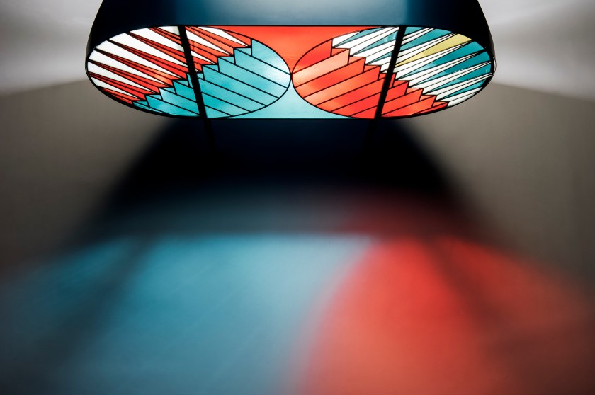
Credenza sideboard by Federico Pepe + Patricia Urquiola. A series of furniture in stained glass that is inspired by the windows of holy sites as the ones created by Gerhard Richter for Cologne’s Cathedral.
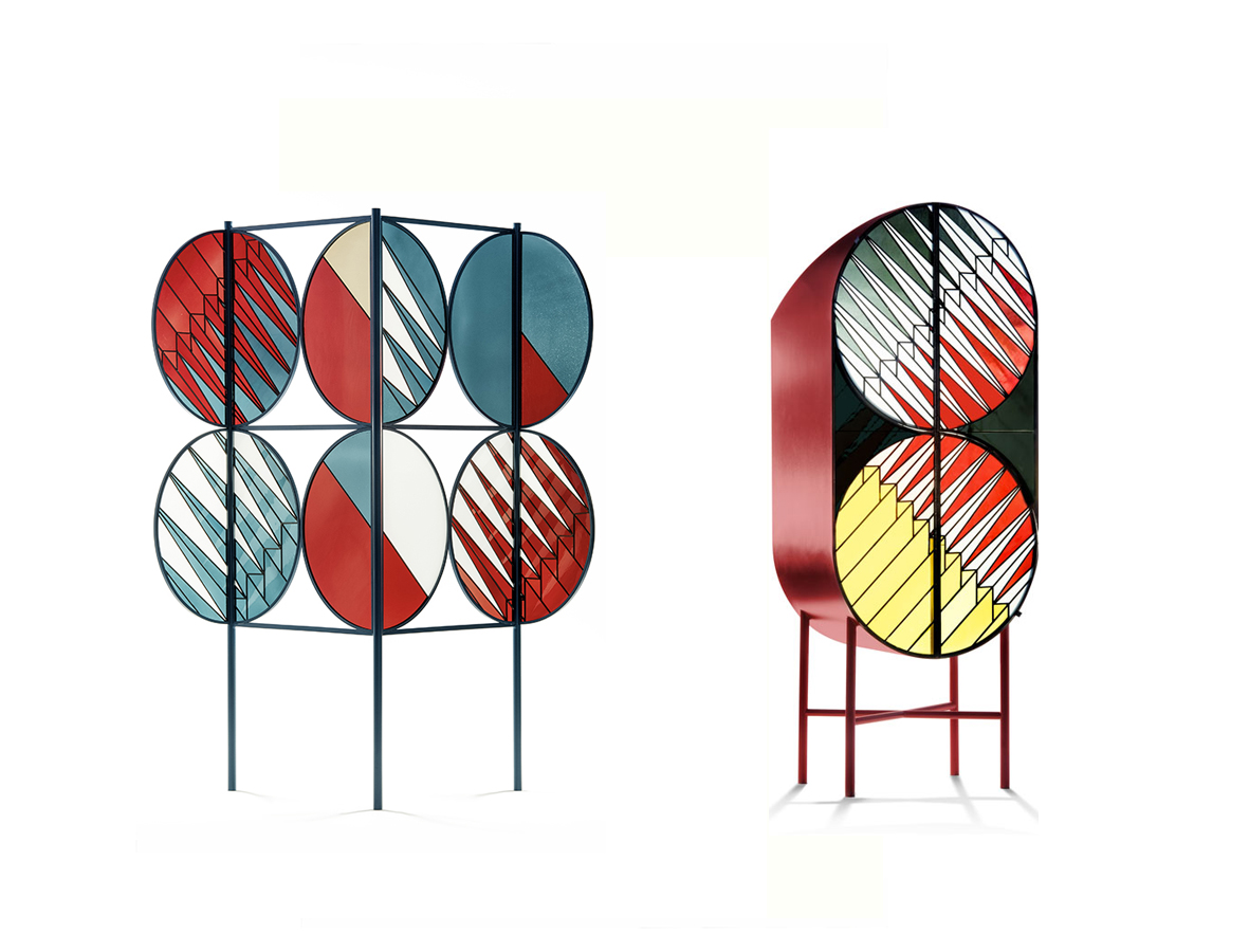
Credenza Screen and Cabinet. Characterized by contemporary patterns, colours and materials, is produced in Italy by artisans skilled in the thousand-year old manual technique of stained glass, generally used for the architectures and the decorations of the churches.
“Being an editor means giving back our idea of beauty. Inspired, valued, creative. The very essence of our collection is personified by the Milanese attitude to distinguish the essential from the superfluous. Celebrating Italian design is our vocation and a role consigned on us by history. Our products are not only “Made in Great Italy” – they are created through a synthesis of traditional arts and techniques with the most cutting-edge designers. The result is not only furniture, but elements of a philosophy that places imagination, quality and splendour at its core.”
Find below some of the projects already edited with the related sketches by their designers. Enjoy!
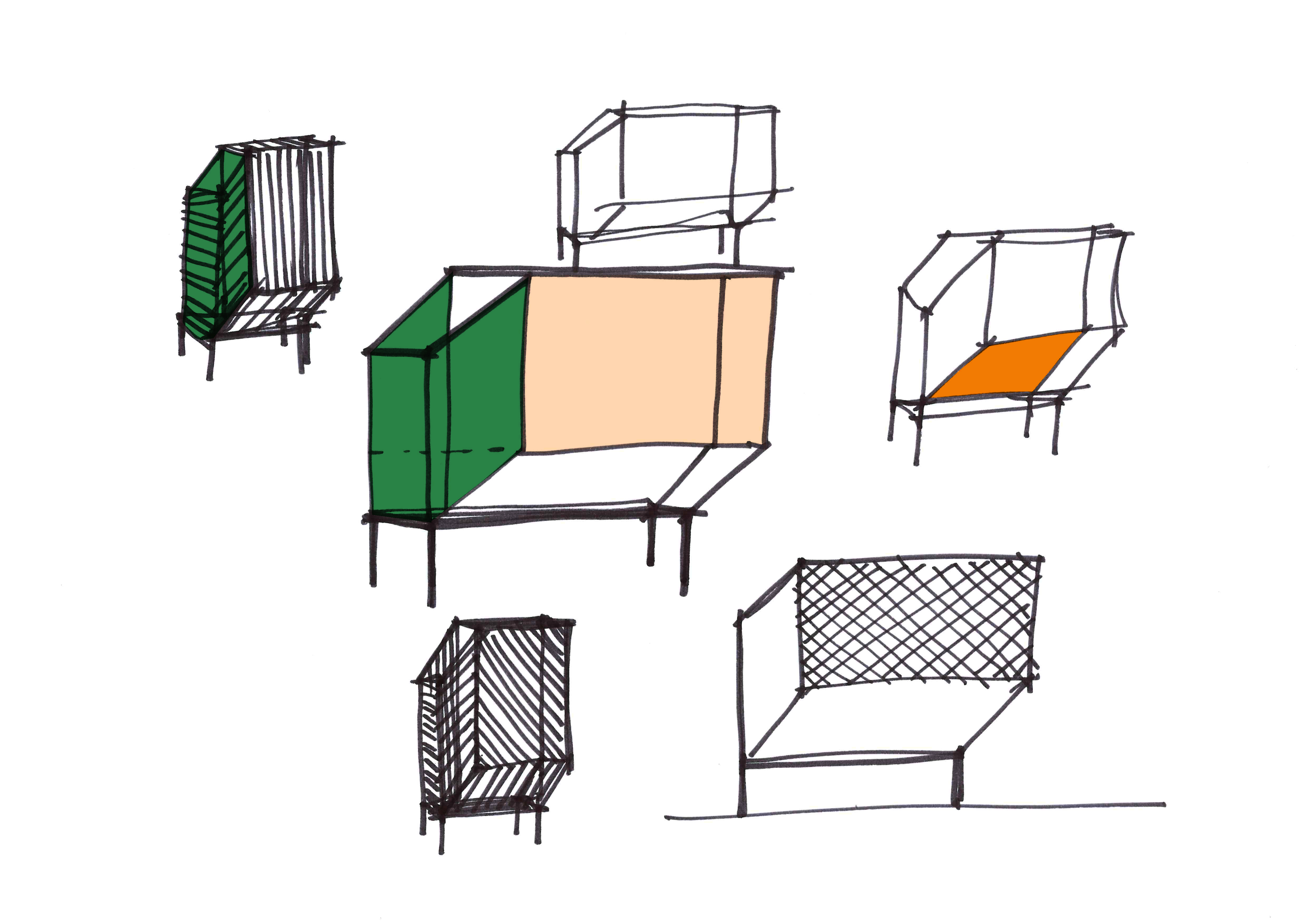
Sketches for Miscredenza by Federico Pepe + Patricia Urquiola. Miscredenza is a series of little architectural furniture, small geometries for every day use enhanced by coloured glass printed with Federico Pepe’s patterns.
Miscredenza consists of one sideboard and two bookshelves, customizable with a selection of different patterns and a distinctive colour palette.
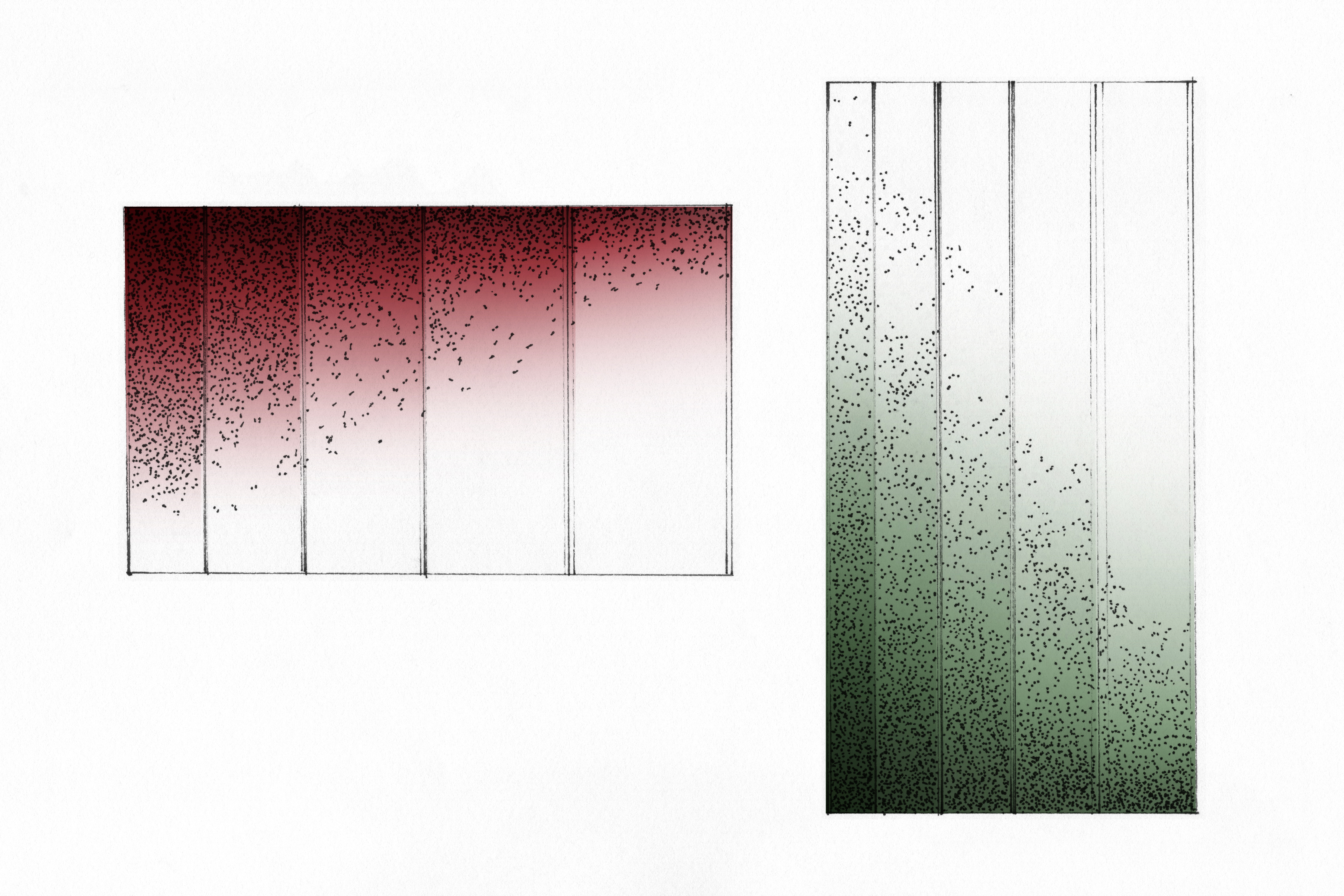
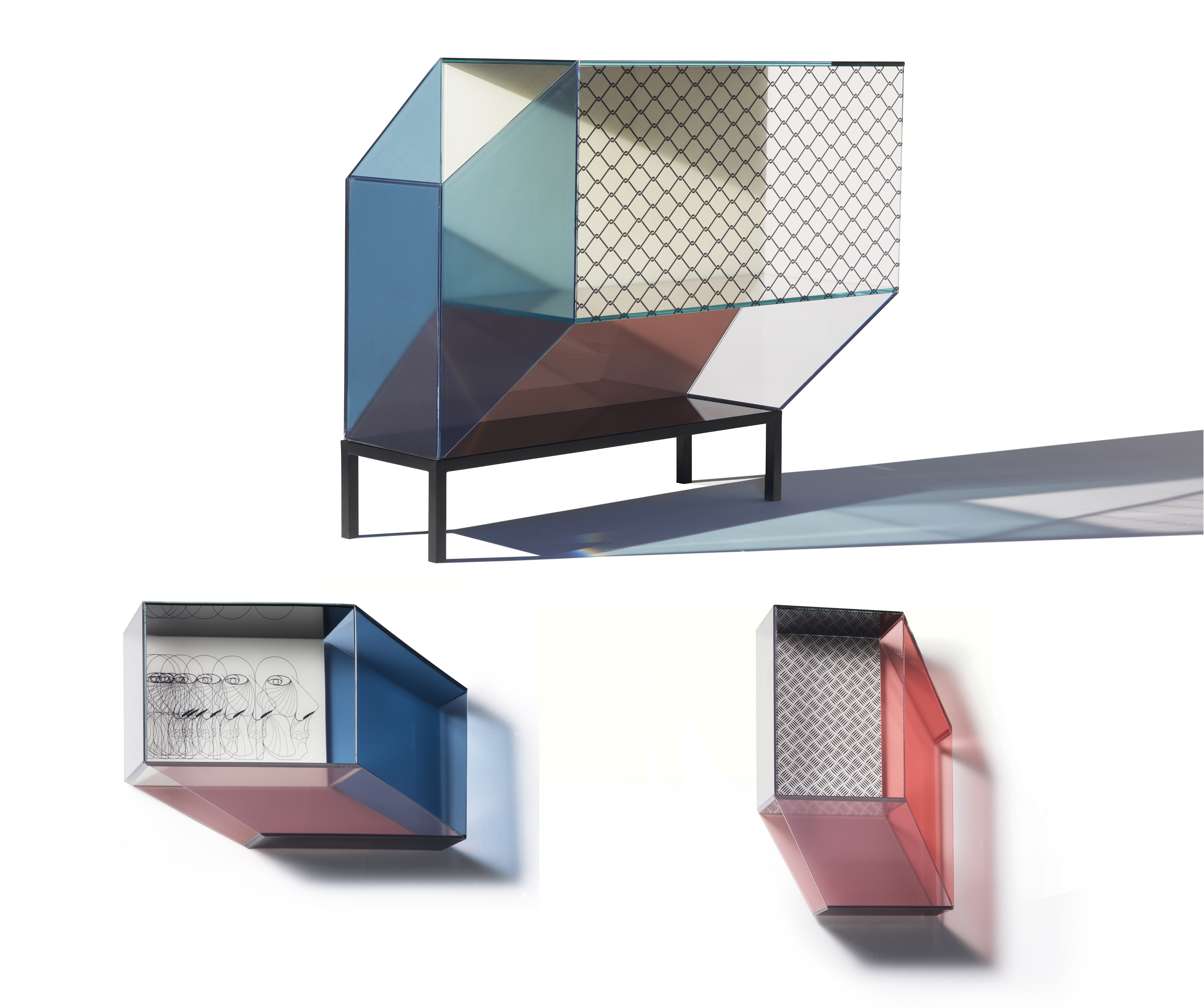
Sketches for “Glimpses” by German Ermics.

“Gradually fading colour in the mirror is slowly revealing or hiding the reflection of a passerby. This is something to experience in motion, yet it’s a static object.”

Sketch for Tripolino collection by Cristina Celestino. Series of low tables in marble and fringes in chromatic contrast.

Tripolino plays with the iconic element of passementerie typically used as a decorative element of bourgeois lounges. Applied to the edges of the table it looks as fringes are sustaining its marble top. The whole structure is made in the same precious marble of the top.
// Editions Milano è un brand nato a Milano che edita arredi e oggetti disegnati da noti designer così come da talenti emergenti,
Il direttore creativo e artista Federico Pepe, ha guidato il debutto di Editions Milano. Autore del logo art decò, Federico è anche co-autore insieme a Patricia Urquiola della collezione in edizione limitata di “Credenza”.
“Editare per noi significa imprimere al mondo la nostra idea di bellezza. Ispirata, ricercata, autoriale.
Significa evolvere l’immaginario materiale e immateriale della nostra città: Milano. La portiamo nel nome e manteniamo nel cuore l’innata attitudine meneghina a distinguere ciò che è necessario da ciò che non lo è. Editare per noi significa celebrare l’Italia: il più grande produttore al mondo di creatività, arte e bellezza. Un ruolo che la storia ci consegna e il mondo ci riconosce.
I nostri prodotti non sono solo “Made in the Great Italy”, ma realizzati recuperando arti e tecniche antiche e mettendole in collisione con i designer e i progetti più innovativi. Il risultato non sono solo elementi di arredo. Ma elementi di una filosofia di vita che pone al centro immaginazione, qualità e bellezza.”
Di seguito una selezione di alcuni dei progetti editati e presentati in occasione dello scorso Salone del Mobile.

Sketch for Triangoli by David/Nicolas.
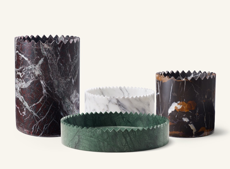
A collection of vases, sculpted from blocks of marbles, they are imagined like crowns, making them both fragile and majestic, serious and playful, they create an element of surprise to a space while seeming endlessly classic.
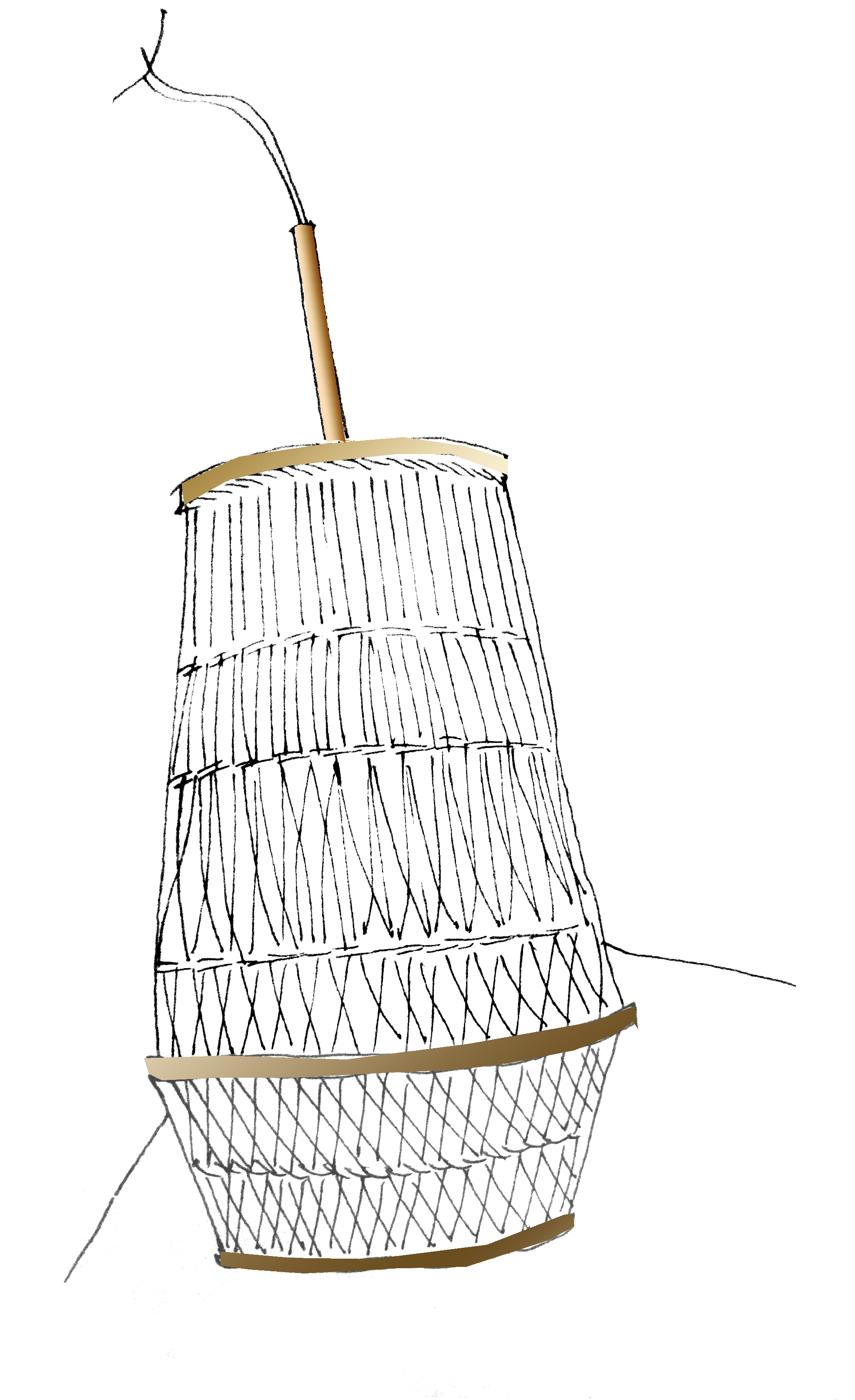
Sketch for Nasse by Chiara Andreatti.
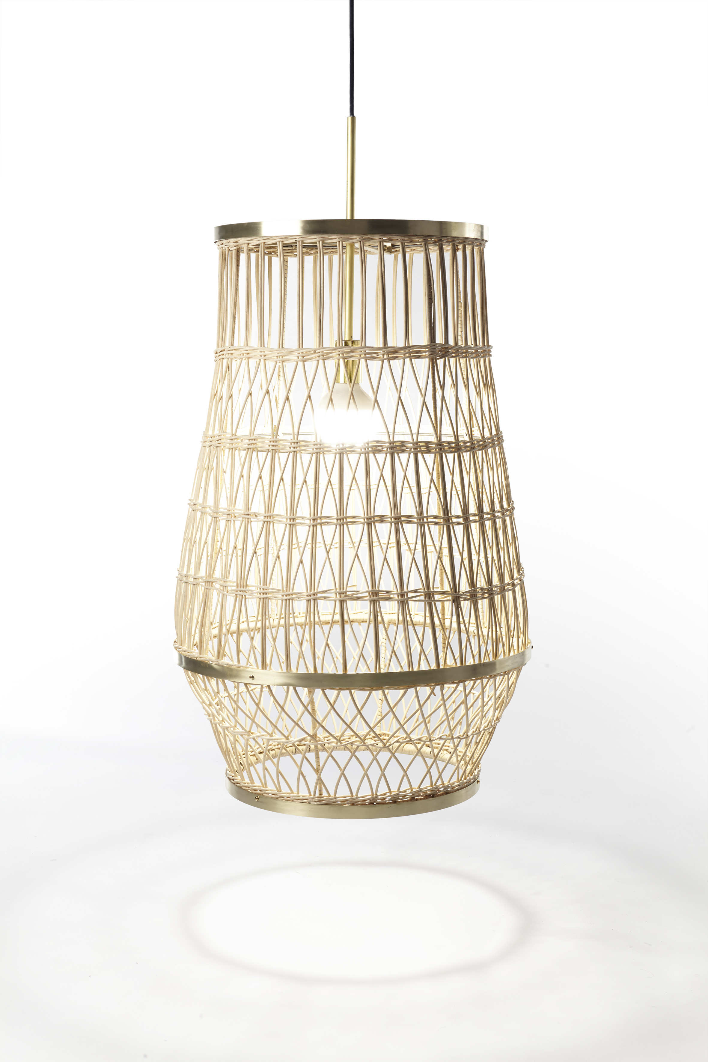
Nasse is the Italian word for fish nets. Nasse is the result of the unexpected combination of two different worlds: a rugged raw material such as rattan and the sharp precision of brass elements.

Sketch for Victoria by Bethan Grey.
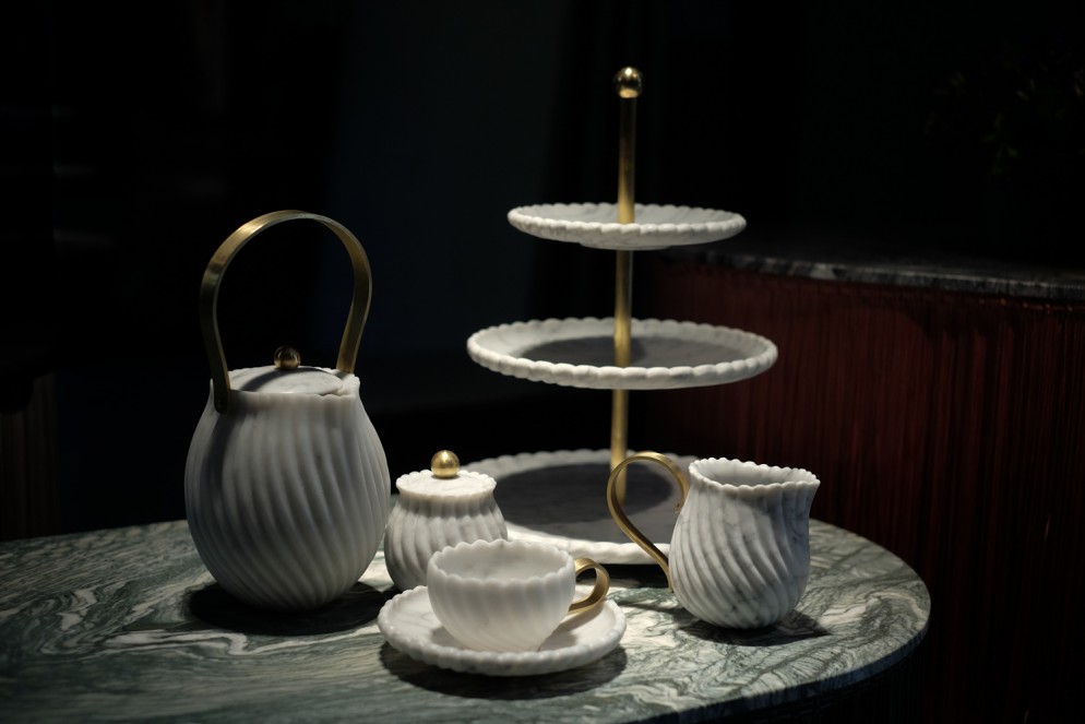
Victoria celebrates the ritual of drinking tea, merging a classic British tradition, with a classic Italian material – marble. The collection features a relief pattern, hand- carved from arabescato marble by Italian master craftsmen.
